Websites for IFAs
Some of our Favourite Websites for IFAs
4th August 2023
IFA Web Pro is a creative website company who have a long history of specialising in the financial sector
working with financial advisers (IFAs), financial planners, and other financial service firms both in the UK and now the EU.
Which are our Best IFA Websites?
We've picked out just a few of our favourite financial planning websites
it's hard to cover all angles and what makes a “good financial advisor website” because it is always so subjective.
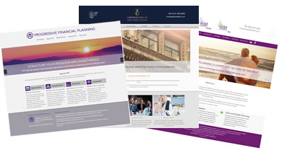
All the sites we design for IFAs and financial planners, we try and make them stand out. We're aware that advisor's demographic is aimed at older clients, those that are perhaps a little less familiar with technology. So simple and intuitive navigation is just as important as making sure what they're searching for is found easily.
We've built many sites for IFAs and financial advisers. Whilst we do the bulk of the work for you, adding content and navigation and coming up with design ideas, your input to make yourselves stand out is vital.
The more information we get from our clients the better, add professional staff photos, think of how you can portray the manner in which you work. think about what you can add to our content offering. The more input we receive from our clients the better their site will be.
What we do know is that we're rarely beaten on price and offer a great service together with free regular marketing material for financial advisers.
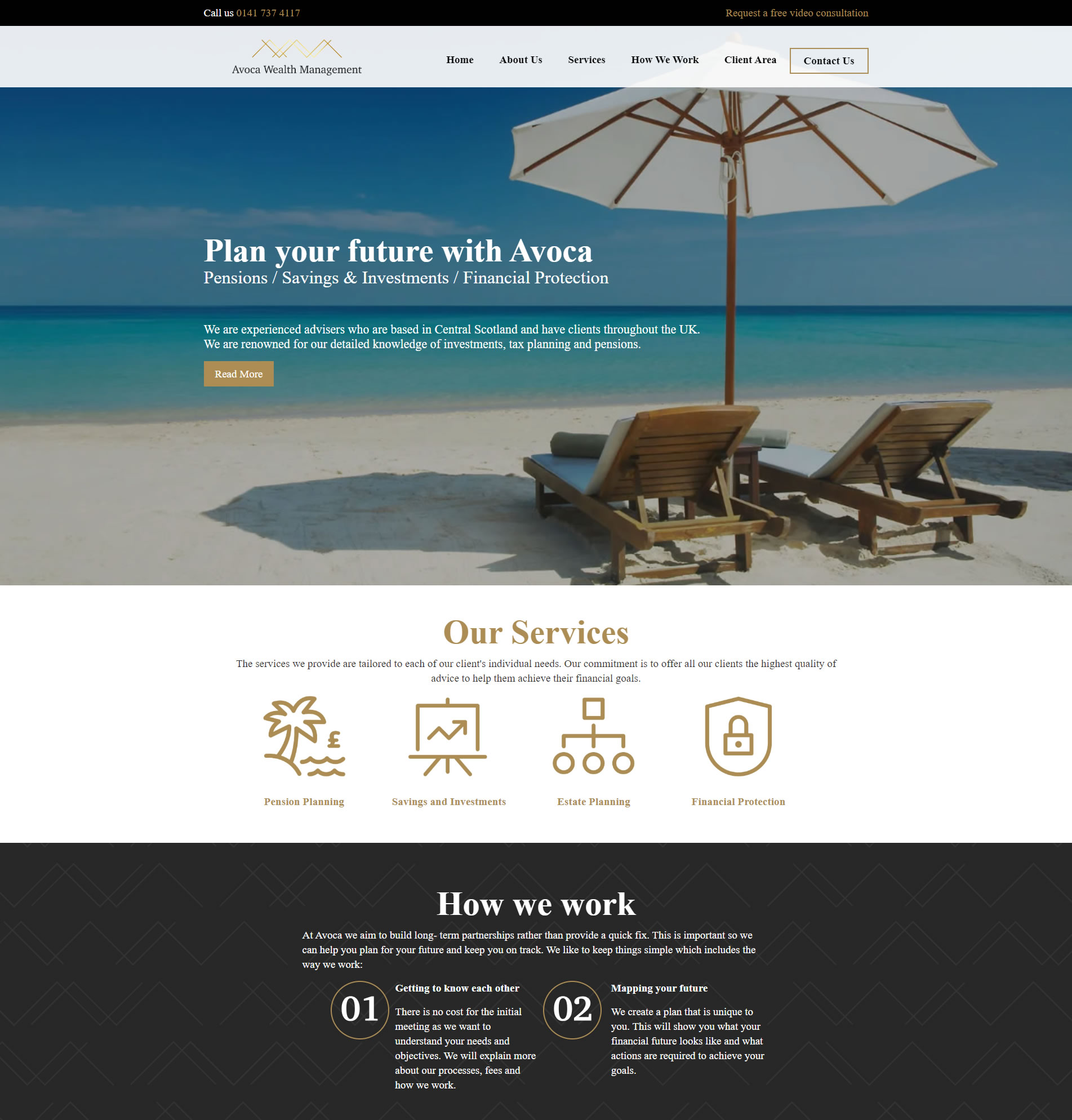
Progressive Financial Services
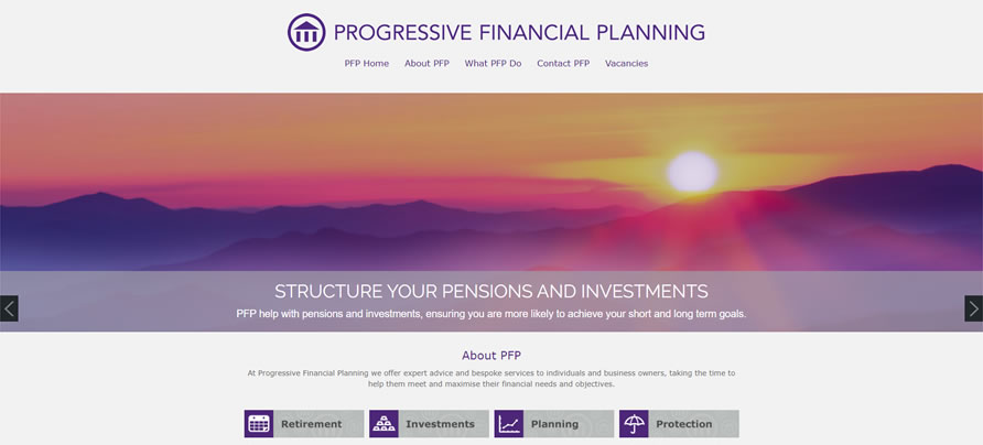
Progressive Financial Planning Limited has been running for 20 years; located in Aylesbury, Buckinghamshire. Ian Runcie wanted a sleek looking website, we worked with his graphic designer to produce a beautiful looking site.
We love the wide images, which were placed prominently on his site. They are dramatic but subtle too, it can be hard getting the right balance.
Calcluth & Sangster Limited
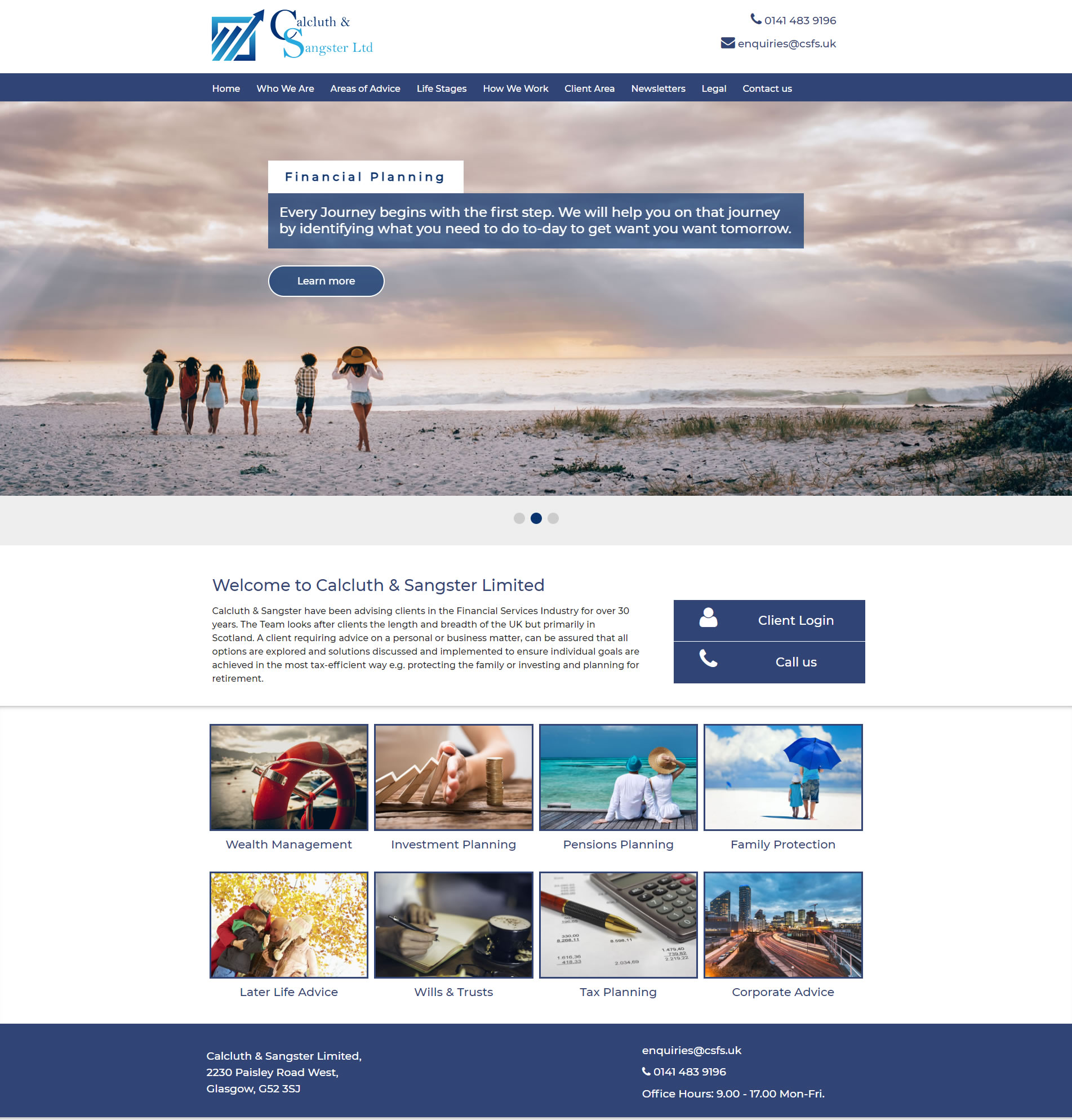
Calcluth & Sangster Limited are based in Scotland and are one of our oldest clients. Their previous site, after many years was starting to look dated. We were very pleased to redesign them a new site, which would meet their needs better. We didn't charge either; as we feel a clients' site needs to grow with them.
Calcluth & Sangster are pleased with the value we offer, a professional website. One which we keep up-to-date, interactive tools - including tax tables for both the UK and Scotland, quarterly marketing material for their clients, a hassle free service and no extra charges.
We know IFA Websites - it's our strength after over 20 years of looking after IFAs and Financial Planners.
Top Tips for a good IFA website
1. Visually engaging - Use eye catching images or slideshows that grab visitor's attention and showcase your firm's services.
2. Great content - Think about who you are trying to attract to your site, the type of clients and what they will be looking for.
3. Build trust - Adding staff photos and client testimonials will help with trust. Make people want to connect with you and see how you take care of your customers.
4. Interactive tools and articles - No one wants a static site (especially not Google), we provide quarterly newsletters and regularly update your content.
5. Clear contact details and calls to action - Make it easy for prospects to get in touch.
Check out some of our Financial Adviser Websites
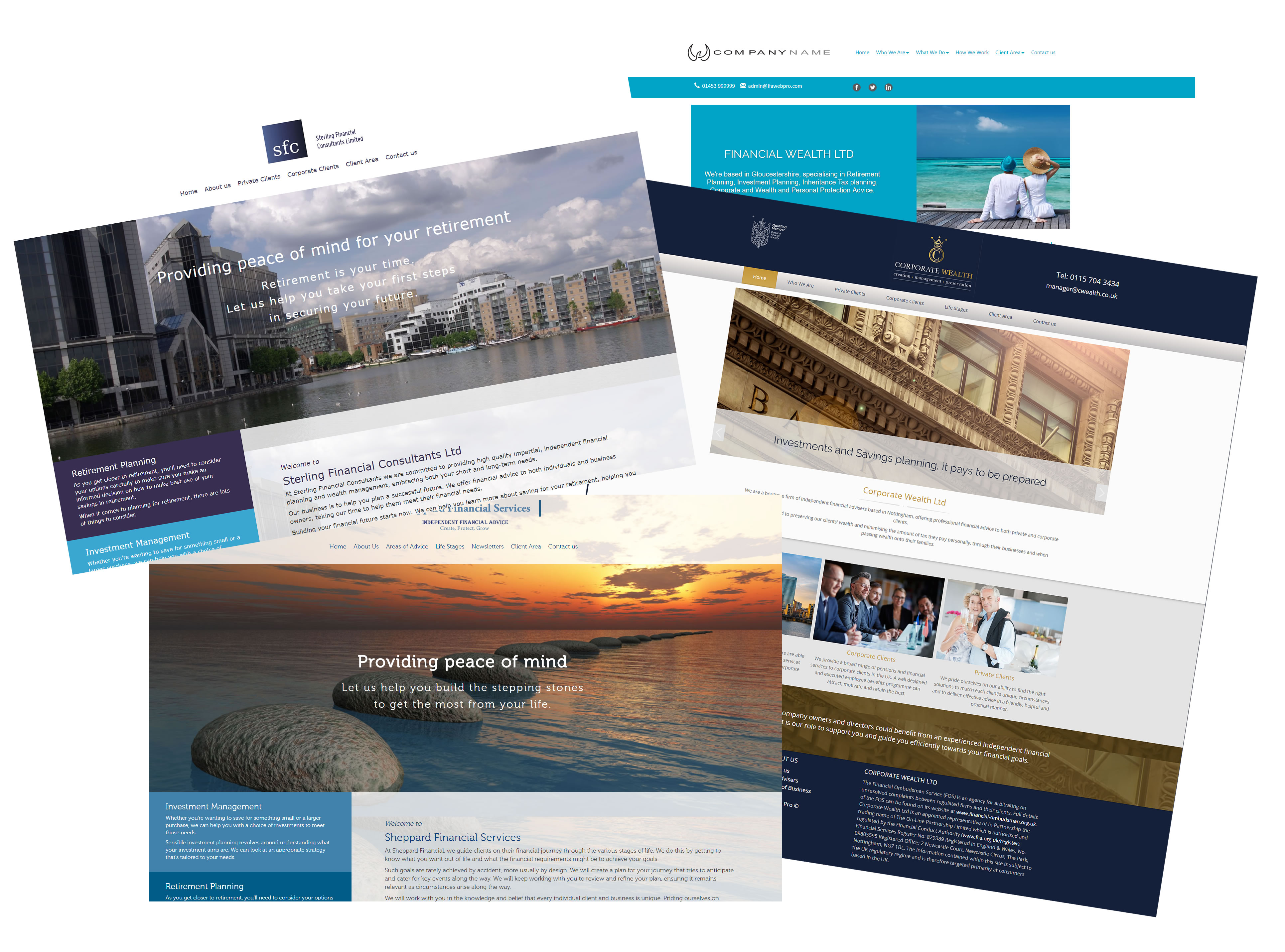
We've picked out 10 examples from our recently designed sites for advisory firms to give you a feel of what we do best. They all have user engagement with interactive tools and regular compliant newsletters.
1. EUI Private Wealth (Ireland - EU)
Quality Financial Planning
EUI Private Wealth are a respected Wealth Management Company offering quality financial planning advice to individuals based in Ireland or moving oversea.
EUI Private Wealth approached us because they wanted a professional website that would service their client's needs. We worked with them to produce a site that would meet their needs and look stunning at the same time.
We added our popular client newsletters too for their UK based clients to aid with their marketing, as a way to stay in touch.
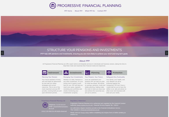
2. Progressive Financial Planning
High Net Worth Clients
The business model of the Progressive Financial Planning is aimed at high net worth clients and this is reflected in the site's use of graphics and imagery. Images can play a large part is the branding of your website and are a critical part of your website design. We were lucky to have a great graphic designer on hand.
We offer free images from Istock, with each of our adviser websites as we have a vested interest in wanting your website to look professional.
We particularly like the attractive way the slides work together with snapshots of those images in each header. It has a brochure type feel to the site, using well written but minimal content and plenty of calls to action.
- Beautiful imagery to reflect their high net worth branding
- Use of a slideshow to market their services
- Attractive presentation of graphics and images
- Brochure type feel
3. Money Flow
Choice of images from Istock
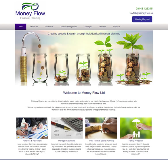
Roland Askew from Money Flow wanted a more modern website, one that had a responsive design and that showcased his services.
Money Flow has a primary focus on Retirement Planning, Wealth Management, Investment Planning and Wills & Trusts.
Because images are so important in the marketing of your site and overall aesthetics we include free images from a number of suppliers. They can make all the difference.
What stands out form their IFA Website
- Large investment image from Istock, we think it looks great.
- Simple intuitive navigation
- Visually eye catching
- Quarterly branded client brochures
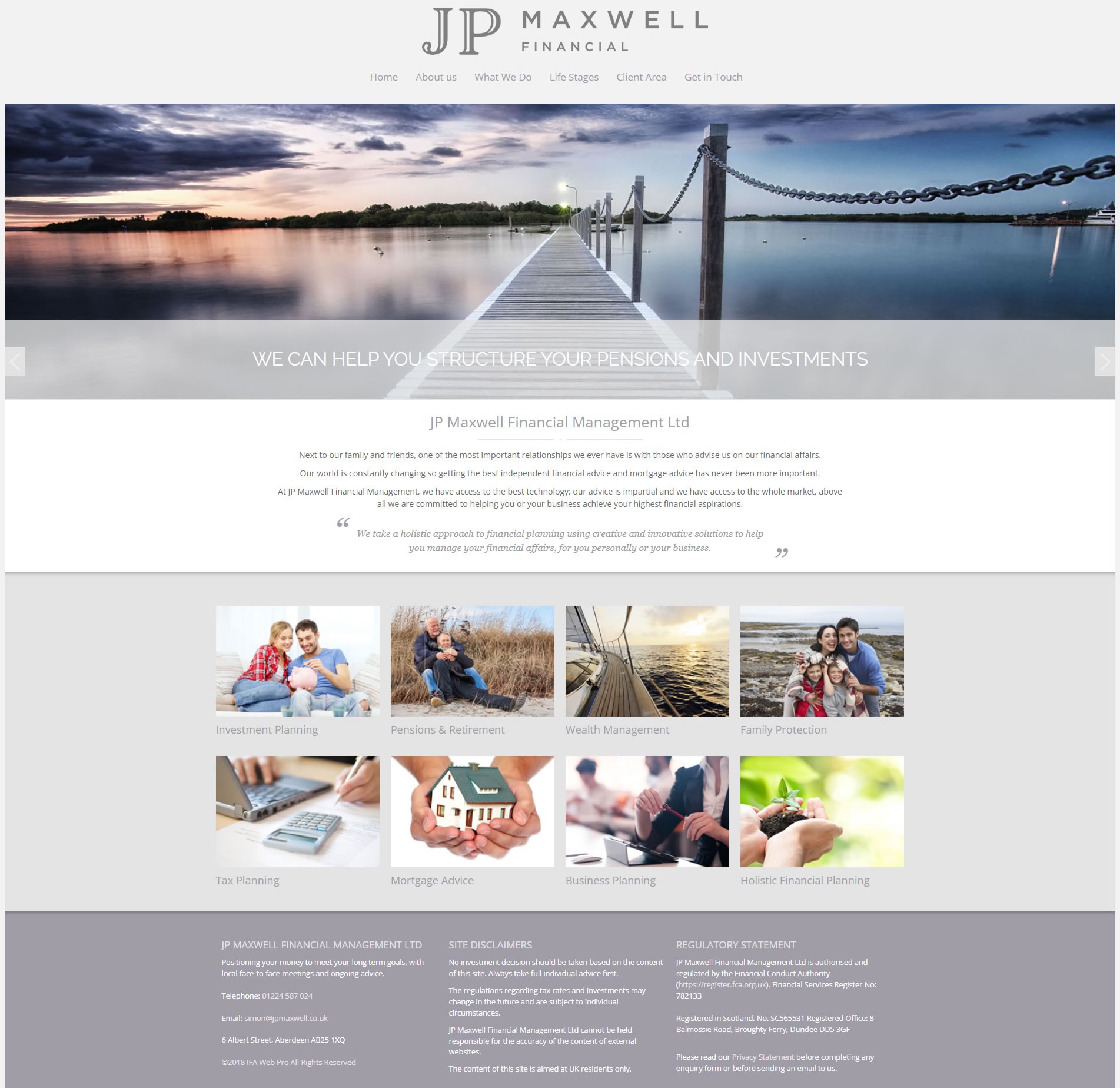
4. JP Maxwell Financial
Attractive muted colour scheme
JP Maxwell Financial is clear about how their services and how they assist clients' in managing their wealth. They also use much of our content to offer clients information on the various financial products on the market.
Their home page uses a large banner image with a clear message about their holistic approach to financial advice.
Our best bits form their IFA Website
- Large banner image
- The design and layout is responsive (as are all our websites), so the site looks great on any device and a number of their services.
- Lovely colour tones
- Attractive design
5. Sherrard Financial Management (IFA Website)
Clean and uncluttered
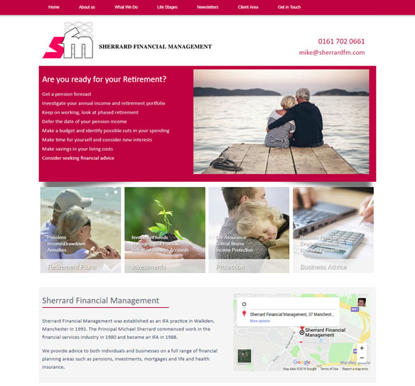
Roger Sherrard form Sherrard Financial Management was looking for a clean uncluttered looking site that reflected their branded. We loved their red and grey colours.
Financial Management is fairly typical content wise of the type of site we produce for IFAs.
Our best bits form their IFA Website
- Clean, plenty of white space
- Lifestages section with useful links
- All of the necessary information can be easily found through the main navigation
6. Abacus Wealth Planning
Fund information for clients
Abacus Wealth Planning Ltd are a wealth management firm based in Brentwood, Essex.
What is useful to Abacus Wealth's clients is that we store all their fund information for their clients to access.
We particular like the moving testimonials at the bottom of the Home page, that we branded using their beautiful red colours.
Our best bits form their IFA Website
- Lovely tones of red and grey
- Fresh white feel to the website design
- Attractive testimonial section
- Stunning images hat were included in the price
7. Austin Chapel - Independent Financial Advisers
Stunning images of Oxford and London
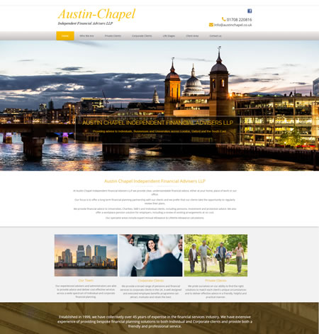
We like the fresh appeal of Austin Chapel's site. Beautiful images of London and Oxford and the simplicity of no slide show (they are a personal preference, bearig in mind visitors rarely get past the second slide). The design offers a visual impact with a crisp, clean design and strong contrasting colours.
Design trends come and go in all areas of business communication and design, and websites are certainly no exception.
Most people respond well to visual content, marketers know that, which is why they use images, slideshows and videos on their sites. For visitors who feel over faced with lengthy content - slideshows can be a good solution.
What we like best
- Eye-catching imagery, making good use of marketing headings and bylines
- Strong contrasting colours
- Simple and intuitive navigation, easy for clients to find their way around
- We added interest to Austin Chapel's website with our branded financial newsletters (they come included)
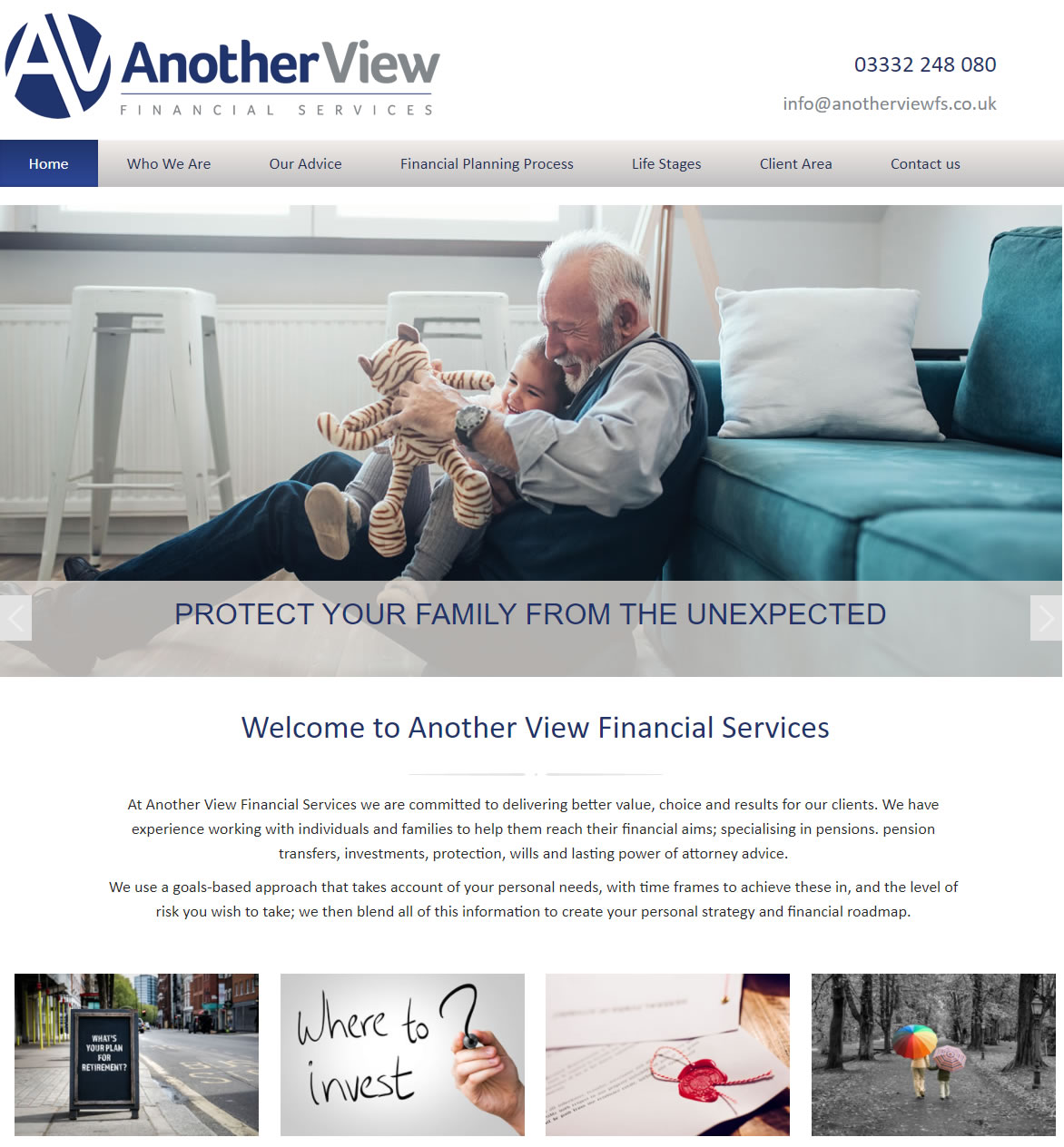
8. Another View Financial Services
Relaxed feel Samantha's clients can relate to
You have to agree their images are lovely. Family orientated, warm and friendly.
Samantha from Another View particularly wanted a relaxed feel, for clients to feel at straight at ease. We feel this was represented in her branding and relaxed images.
We used much of the content with have for other IFAs and added additional content on Estates and Will writing.
- Clean and simple logo
- Stunning images (we included from Istock, our preferred stockist)
- Just their photos!
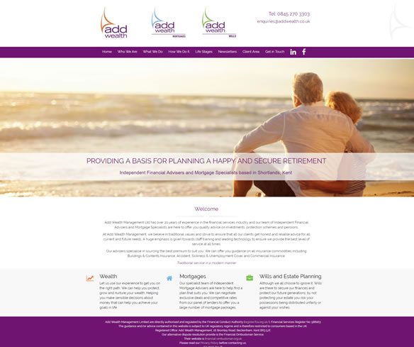
9. Add Wealth Management
Individual Design Aspects
Add Wealth is a Wealth Management firm based in Kent, they were looking for a templated site but one that certainly didn't look like it was built from a template.
It's hard to get across to IFAs what we do, we tell them that we adpt our templates to suit and don' charge extra.
We adapted one of our templates (without charging extra), to showcase Add Wealth's 3 service areas (Wealth Management, Mortgages and Wills & Trusts) separately but in one website.
We understand one size doesn't fit all!
- Adapting one of our templates to tie in with the clients unique branding.
- Simple but attractive colour scheme
- Bespoke Client Survey
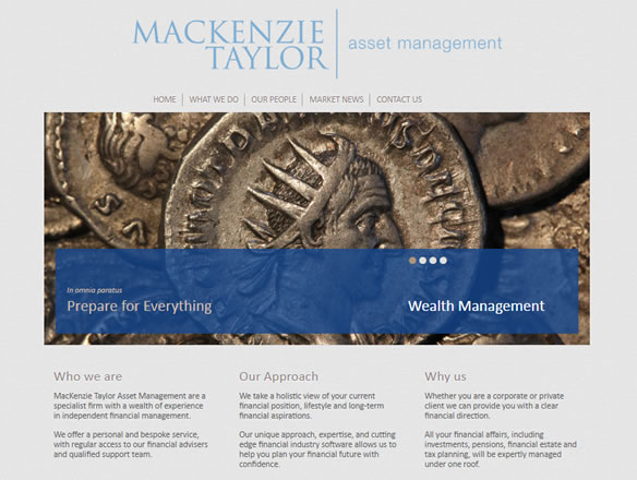
10. McKenzie Taylor (Financial Planner Site)
Classy Website
The business model of the MacKenzie Asset Management is aimed at high net worth clients and this is reflected in the site's use of historic imagery. Images can play a large part is the branding of your website and are a critical part of your website design.
We offer free images from Istock with each of our adviser websites as we have a vested interest in wanting your website to look professional.
- Historical imagery to reflect their high net worth branding
- Use of a slideshow to market their services
- Attractive presentation of their staff
- Brochure type feel
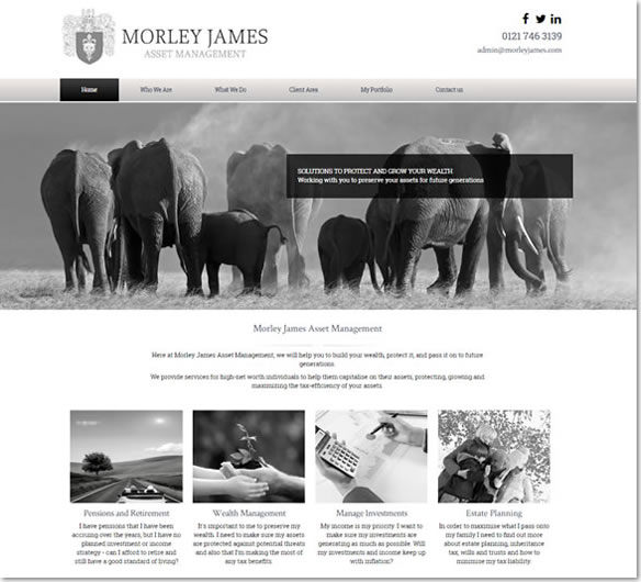
11. Morley James (IFA Website)
We love the black and white images
Colour is one of the most significant elements of any website design. It creates emotion and reinforces a brand. Morley Jame's site makes excellent use of black and white imagery.
Morley James is a good example of one of our IFA Sites where the content is predominately written by ourselves. All of our generic content has been FCA compliant approved.
- Beautiful eye catching front page image
- Makes full use of our financial brochures which are included in the £40pm fee
- The icons add a nice visual touch
- Portfolio Page for Morley Jame's clients
12. Keyline Financial Solutions
Website Redesign
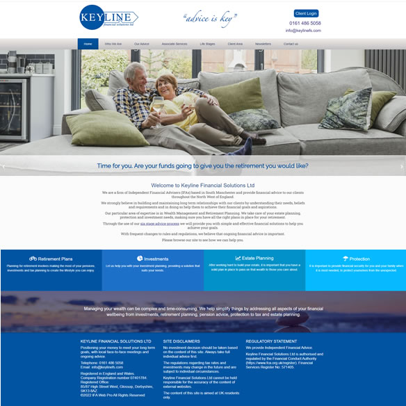
Martin from Keyline Financial Solutions approached us because his current website provider had informed them that they had to upgrade their current site together with a hefty price increase. There was no flexibility offered for both the design or price of their new website, which was disappointing considered Keyline's site was only five years old.
It was crucial to Keyline Financial Solutions that we did the vast amount of the website build (we always do!) and that we kept the new design in keeping as much as possible with their original site. Their clients are older and Keyline wanted us to provide them with some familiarity.
We are always very flexible in our approach to IFAs, so we designed a site around one of our website templates , using aspects from Keyline Financial's original site, bringing it up to date and making it mobile responsive.
It's a very personal looking site, it has many of the images from keyline's original site, together with additional features and content.
How we helped Keyline Financial Solutions to rebrand their old site
- Customised website design to reflect their branding.
- An additional of a slideshow to one of our designs, Keyline wanted us to add movement to their website to give it a modern feel.
- Their old site wasn't mobile responsive, of course this one was, all our sites are.
- The new site was far more comprehensive content wise than their original site and we kept their monthly fee the same.
- Contact information including address, email, and phone number are easy to find.
- We kept the colour scheme and images in line with their original site, repurchasing them where we needed to from our image stockists.
- Adding up to date visuals for their financial planning and life stages pages.
Top Tips for a great Financial Adviser Website
- Build trust - It's always worth adding staff photos and feedback. Helping prospects relate to you and build trust is key to new business.
- Relevant Content - Think about what your prospective clients will be searching for. Add bite sized teaser text and images to catch their attention.
- Interactive tools and fresh content - No one wants a static site (especially not Google) which is why we provide quarterly client newsletters and regularly update your website.
- Calls to action and Get in Touch page - Make it easy for prospects to get in touch.
We don't just stop with your website!

Website Redesign
Martin from Keyline Financial Solutions approached us because his current website provider had informed them that they had to upgrade their current site together with a hefty price increase. There was no flexibility offered for both the design or price of their new website, which was disappointing considered Keyline's site was only five years old.
It was crucial to Keyline Financial Solutions that we did the vast amount of the website build (we always do!) and that we kept the new design in keeping as much as possible with their original site. Their clients are older and Keyline wanted us to provide them with some familiarity.
We are always very flexible in our approach to IFAs, so we designed a site around one of our website templates , using aspects from Keyline Financial's original site, bringing it up to date and making it mobile responsive.
It's a very personal looking site, it has many of the images from keyline's original site, together with additional features and content.
- Customised website design to reflect their branding.
- An additional of a slideshow to one of our designs, Keyline wanted us to add movement to their website to give it a modern feel.
- Their old site wasn't mobile responsive, of course this one was, all our sites are.
- The new site was far more comprehensive content wise than their original site and we kept their monthly fee the same.
- Contact information including address, email, and phone number are easy to find.
- We kept the colour scheme and images in line with their original site, repurchasing them where we needed to from our image stockists.
- Adding up to date visuals for their financial planning and life stages pages.
- Build trust - It's always worth adding staff photos and feedback. Helping prospects relate to you and build trust is key to new business.
- Relevant Content - Think about what your prospective clients will be searching for. Add bite sized teaser text and images to catch their attention.
- Interactive tools and fresh content - No one wants a static site (especially not Google) which is why we provide quarterly client newsletters and regularly update your website.
- Calls to action and Get in Touch page - Make it easy for prospects to get in touch.
We don't stop at providing your financial advisory company with a website. We produce advisers with financial newsletters to send to their clients.
Our financial newsletters are included in the website fee. Newsletters not only add interest to your website. They can be a great way to stay in touch, your mailing list being your best marketing asset.
The simple act of mailing out your financial newsletter reminds your clients that you're thinking of them and reminds them of your worth.
A Logo, professional images and regular marketing material is included with your site.
Want to see more of our financial website designs?
Our Designs IFA Sites Compare usIFA Web Pro are website designers working specifically with the IFA market, supporting clients with marketing (Client newsletters and tips) and Search Engine Optimisation; everything they need to get ahead.
Give us a call or Contact us, we'd love to hear from you.
Our financial website templates and marketing support can help you grow your advisory business. We offer an all-in-one website solution for IFAs and other advisers.
We deliver on our mortgage client’s expectations, on assisting them in growing their broker business. Have a look at our range of semi-bespoke template websites.
We offer free FCA compliance approved newsletters with our IFA websites (or £60 per newsletter issue without a website). It's a pretty good deal however you look at it.
Get in touch and see how we can help you. For over 20 years we have been supporting financial advisory firms with an online professional website presence.

