Responsive Website Design
Website Design Trends
Over the last decade responsive website design has made it's presence known. It is now the new standard for web design in general. An increasing number of websites are opting to go down the path of responsive web design.
What is Responsive Website Design?
Responsive web design is an approach to web design aimed at developing websites to provide an optimal viewing experience - easy reading and navigation with a minimum of resizing, and scrolling, across a wide range of devices.
The difference between responsive and mobile website design
Responsive Design is not the same as mobile design. Mobile design is when an entirely new website is created (or web app) with content specifically created for the mobile experience. Responsive Design, means that the same domain and content respond to different viewports to provide the best user experience possible for each device. The different viewports include desktop monitors, laptops, tablets and mobile devices (and their corresponding orientations). If you resize your browser window, you'll see the screen elements resize themselves.
Large Background Images
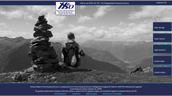
Full-screen, background photos are still very much a popular trend among the web community; it's a trend which has been around for some time. Dramatic large images are often used for landing pages, one-page websites or portfolios. We've seen a decrease in the cost of professional images with stockists like Shutterstock and Deposit Photos competing on price. Even Istock and Getty have finally lowered their prices. This makes these types of websites much more affordable.
Scrolling and “above the fold”
If you're active on social media you've probably already experienced “long scrolling”. Websites like Facebook, Twitter and Pinterest, all feature long news feeds that lead viewers to continuously scroll. This design concept is based on the presumption that visitors don't want to waste time waiting for information to load, and can simply scroll down in order to see more content.
It used to very much be the fashion of keeping content “above the fold”. Google still gives content above the fold priority. There is a balance to be struck between pleasing Google and giving the best user experience.
Website Content above the fold
The 'fold' is where the bottom of the screen is on page load. When you land on a website, any content you immediately see without scrolling is 'above the fold'. Anything you have to scroll down to see it 'below the fold'. Google still gives importance to information above the fold.
Focus important information above the fold
The arrival of smartphones and tablets has changed the way people navigate around the internet. Smartphones taught users how to scroll and swipe, and to an extent will affect the way webpages are designed.
Information above the fold is still hugely important, we now need to narrow down our focus, using space above the fold to share our main ideas that will make people want to read the rest of the page.
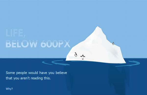
Life below 600px
Paddy Donnelly makes a good point on his website: Life below 600px. Longer pages, well presented and engaging that tell a story, make for a great user experience. Personally I prefer a mixture on my IFA Web Pro website, as I know users will want to see things quickly, yet once enagaged will scroll. For me a balance works. By having a mixture of shorter and longer pages it means I can still have some pages where important information is placed above the fold (but not squashed), that way Google and SEO are “pleased” and the user gets a positive experience.
As Paddy says: “Just put a bit of thought into creating quality content and presenting it in an interesting and readable way. This will make visitors stick around for a while and use that magic scroll button.”