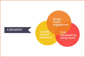
What makes a Good IFA Website?

Strong message:
Make it clear what your company does and what services it offers on the website's homepage.
Before you choose a IFA template design you like or let us know about a design or style you've seen; you need to think about what it is you'd like to market / portray on your home page.
Website Design
Have a look at our IFA template designs and our portfolio of financial websites we've created for other clients. If nothing catches your eye think about which adviser websites have you seen yourself that you and your colleagues like? This will give you a starting point.
You can look at the website listed on Unbiased if you're short of inspiration. Let us know if you see any features you like, we can often amend outr templates for an extra amount without going into the price structure of a more expensive customised site
Easy Navigation:
Make the site easy to navigate.
We always make sure our IFA websites are easy to navigate. We will encourage a main top navigation and a side navigation showing relevant services that are customised to the section you're in (apart from on the Home page).
It's important to remember your target audience aren't all IT literature and comfortable with navigating around a website. It's important to make their journey as intuitive and as simple as you can.
Gain Trust
When a prospective client lands on your website for the first time, you typically have no longer than a split second to make a good impression before that person clicks away. In that split second, you need to convince that person that you are a trusted source.
When people feel insecure about something, they look around for validation. You need to show them that other people trust you.
Testimonials and a photo of yourself or your team will gain a client's trust.
Clear Charging:
In the interests of transparency (and Post RDR) showing a well-explained charging structure is always a good move. If there is one thing that every prospective clientr wants to know, it's “What is this going to cost me?”
Look and style:
To make sure your website is attractive to look at and read we've done our best to break down content into bite sized chunks and use imagery. It's a well known fact that people won't spend long on a website reading content, so it's vital to grab their attention.
We have our own IFA designer who will update your website for you, ensuring it stays looking as engaging as it can.
SEO and Marketing:
If it's important that you're found on Google you need to pay attention to SEO and Marketing.
All are websites are “Search Engine Optimised”. This means we've kept to update with the latest advances on SEO:
- Unique accurate page titles (title tags)
- Brief but descriptive titles
- Individual “description” meta tags
- Simple to understand URL structures
- Easy Navigation
- 2 sitemaps, one for users, one for Search Engines
- Quality content and services
- Suitable anchor text
- Optimise use of images
- Brief but descriptive alt text
- Good use of Headings - H1, H2 etc..
We've joined forces with an SEO specialist who can offer free health checks on your website
Content:
Articles published on the website for the benefit of existing or new clients will engage their interest, for this purpose we create quartetly newsletters as well as An annual Autumn statement and budget report. If you have newsletters and brochures of your own, we'll happily add them to your website.
Prominent Contact details:
Make it easy to determine who to contact for more information. For this purpose we can add call to action butons at the bottom of longer pages as well as “Get in Touch today” link on both the top and side navigation.
