Responsive Website Designs for IFAs
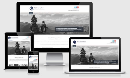
Websites are responsive to screen size
January 2018
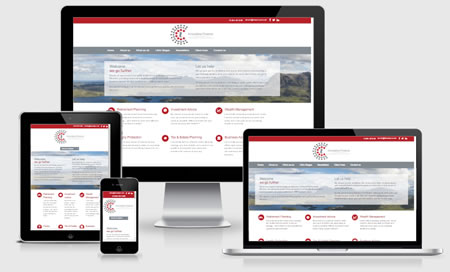
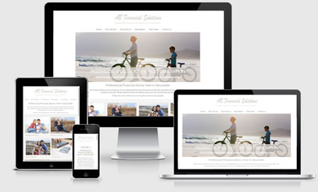
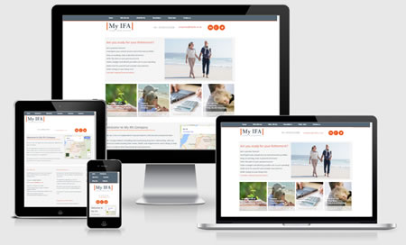
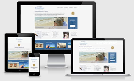
All our designs are responsive. That just means that they work on every kind of mobile device, responding to the browser screen size.
It's important to be responsive
Website clients are often on the move accessing smartphones and tablets to surf the internet. A responsive design will enable your website to adapt to any device or screen size your visitors may be using.
Google prioritises websites (for mobile searches) that are “mobile friendly”. So if your current website isn't mobile-friendly, Google won't look kindly when ranking you.
Our website designs
We currently have 8 website designs, they can all be adapted to suit your firm, with varying focus, content and navigation. We do build each site individually, so if there's something you think your clients can benefit from, just ask.
Is my Site Responsive?Design A
Design B

Design C
Design D
Design E
Design F
Design G

Design H

